
RGB or CMYK? The Best Color Profile for Fine Art Prints
If you’ve started thinking about creating art prints from your original artwork and poked around the internet for how-to's, you might have heard “RGB is for screens, CMYK is for print.”
And while that’s true in some cases, when it comes to making color accurate fine art prints, it’s not the best rule to follow.
Let me break it down for you, so you can decide what’s best for your art prints.
What Is CMYK?
CMYK stands for Cyan, Magenta, Yellow, and Black (K). These are the four colors traditionally used in offset printing, which is often used for things like books, packaging, and mass-produced products. Offset printers use metal plates and apply ink in layers to build up your image.
The main thing to know here (and probably the most important) is that CMYK has a smaller color range (or "gamut") compared to RGB. This means it can’t capture all the vibrant, saturated colors you might have in your original artwork. Even if your art is mostly made up of neutrals, there may be some colors that are still out of range. Reds and purples in particular often print a bit duller.
CMYK can be used for digital printing too, but if your goal is to make fine art prints that look as close to your originals as possible, CMYK can prevent you from doing just that.
What Is RGB (and Why sRGB Matters)?
RGB stands for Red, Green, and Blue—the three primary colors of light. It’s the color profile used for screens and digital files, and it has a wider color gamut than CMYK, which means it can display and print more vivid, rich colors.
When making fine art prints, especially with high-quality inkjet printers (like Epson or Canon), RGB is actually what you want. These printers often use 8 to 12 ink tanks, allowing them to recreate a much broader color range than traditional four-color CMYK systems.
The specific profile you’ll want is sRGB, which is the standard RGB format for most digital printers. This will help recreate true to life colors for your prints, and impress your collectors.
Quick Tip: Ask Your Printer
If you’re sending your files to a professional print shop, always check what color profile they prefer. Some might list it on their website or FAQ page. If not, don’t hesitate to reach out and ask! This one step can save you a lot of frustration later.
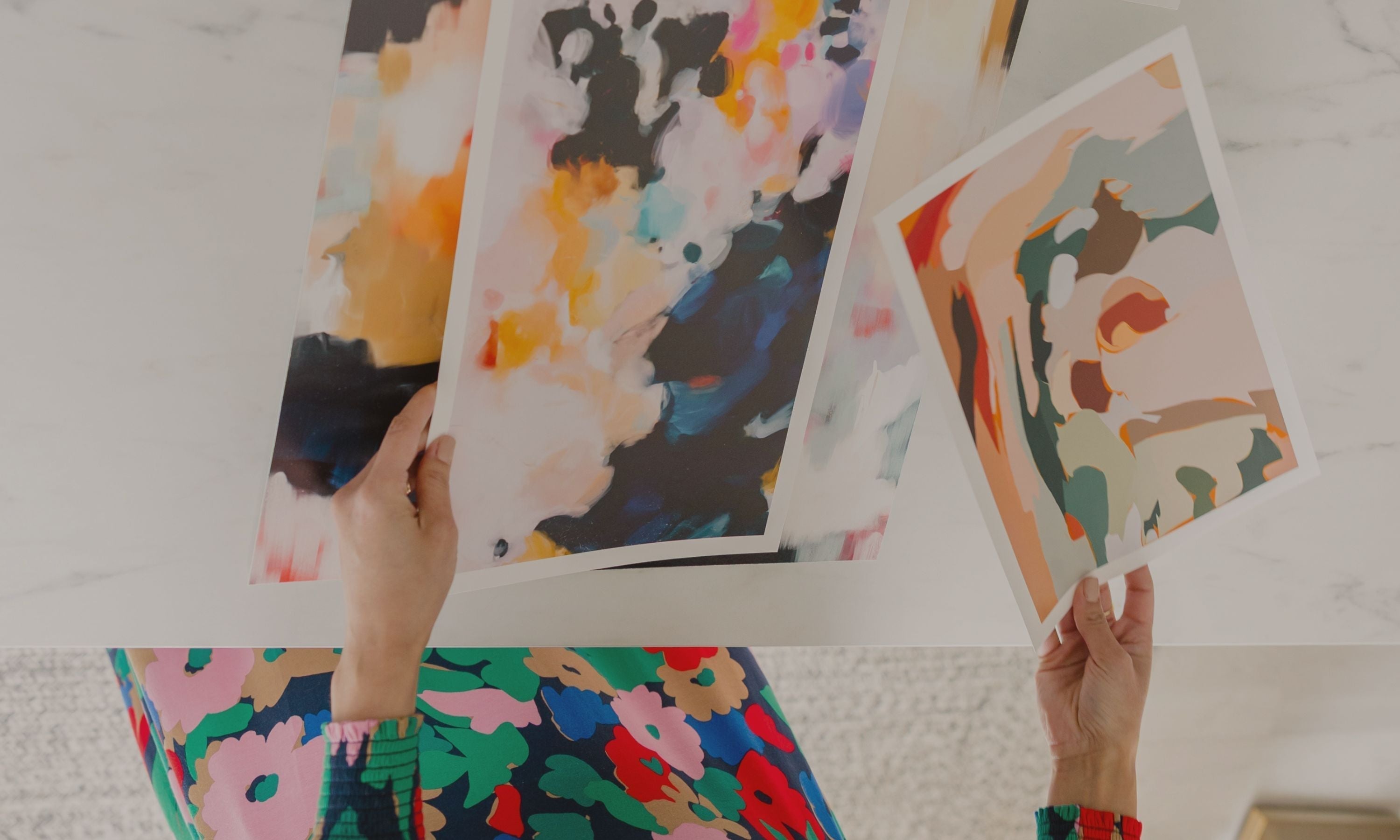
Capturing Your Artwork
Whether you're a traditional or digital artist, how you capture your artwork matters:
-
Scanning originals? Choose RGB as your color mode.
-
Photographing your art? It will naturally be in RGB.
-
Creating digitally? Set your canvas to sRGB from the start, and avoid having to convert it later.
When to Use CMYK Instead
There are times when CMYK is the right choice:
-
If you’re designing for products like mugs, fabrics, or stationery, which often uses offset printing.
-
If your print includes special finishes like metallic foils or screen printing—these processes typically require CMYK files.
What About Converting Between RGB and CMYK?
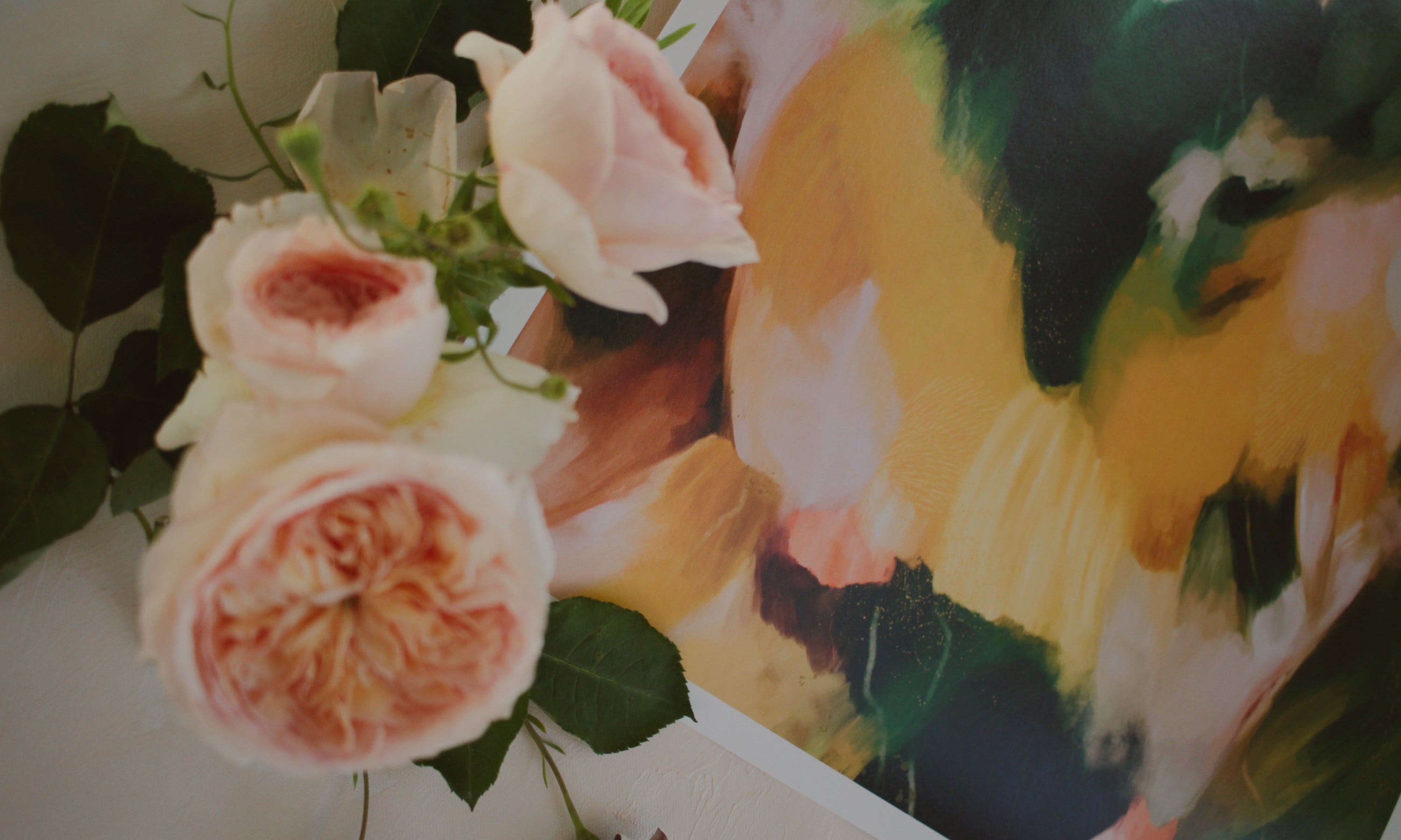
You can convert RGB files to CMYK, but here's the catch: you might lose color vibrancy, especially in bright, saturated areas. The colors can shift noticeably, and not always in a good way. You might see the biggest difference in reds, purples and oranges.
Take a look at the example below. On the right is the art in RBG and on the left it's in CMKY. Samples were taken from the same spots. As you can see the CMKY red and purple experience a shift in tone.

On the flip side, converting CMYK to RGB is usually safer, with minimal color loss.
Final Takeaways
Know what you will be using the artwork for and choose the appropriate color profile. Remember, RGB for prints. CMYK for products. If you plan to do both, then choose CMYK, just keep in mind that they might not be color accurate.
-
Use sRGB for fine art prints, especially with inkjet printers.
-
Use CMYK for products that use offset printing, like stationery, fabric, or packaging.
-
Color shifts happen when converting from RGB to CMYK—so keep that in mind!
-
Always check with your printer to confirm which color profile to use.
Making your own fine art prints is exciting, and getting your colors right is one of the most important steps. With the right setup, you’ll be well on your way to creating stunning prints that truly do your beautiful artwork justice.
Leave a comment
This site is protected by hCaptcha and the hCaptcha Privacy Policy and Terms of Service apply.